


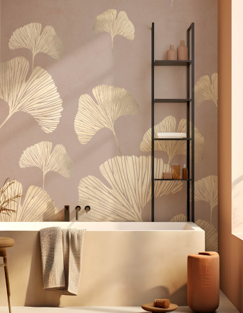

Wallpaper for Dark Rooms: Colours, Patterns & Finishes That Add Light
Introduction Some rooms just don't get enough sun. Maybe it faces north, maybe a nearby building blocks the light, or maybe the windows are just small. Whatever the reason, a...
Introduction Some rooms just don't get enough sun. Maybe it faces north, maybe a nearby building blocks the light, or maybe the windows are just small. Whatever the reason, a...

Some rooms just don't get enough sun. Maybe it faces north, maybe a nearby building blocks the light, or maybe the windows are just small. Whatever the reason, a dim room can feel flat, and most people's first instinct is to reach for white paint and call it a day.
Here's the thing though, white walls don't always fix a dark room, and sometimes wallpaper does a far better job. The right colour, pattern, and finish can lift a space in ways flat paint can't manage. This guide walks through how to pick wall paper design choices that actually brighten a dark room, instead of accidentally making it feel smaller.
Yes, and honestly, it often does more for a dim room than paint alone. Wallpaper isn't just about colour. Texture, sheen, and pattern all play a role in how light bounces around a space.
A subtle shimmer or soft metallic thread catches whatever natural light is available and scatters it back into the room, creating brightness even when actual light levels haven't changed. Pattern can add a sense of depth too, but scale and contrast matter here. In a dim room, an open composition with some breathing space usually works better than a dense, high contrast repeat, since a busier, tightly packed print tends to make the room feel more closed in rather than lifting it. Colour choice matters most, and that's where people get it wrong.
Light, warm neutrals tend to work best. Soft creams, pale yellows, and warm whites reflect available light rather than absorbing it, keeping a room from feeling heavier. A gentle beige coloured wallpaper is a reliable pick, since beige carries enough warmth to avoid feeling clinical while still bouncing light around the room.
Cool greys can work too, but only in the right shade. A plain grey wallpaper in a lighter tone stays airy and calm, while darker charcoal grey tends to swallow light instead of reflecting it. Want more personality? A soft abstract colour wallpaper in muted, light toned shades adds visual interest without dragging the room down the way a bold, saturated pattern might.
Large scale florals. Big, open floral prints in pale backgrounds add movement and softness without cluttering the wall. Scale matters here, since tiny, tightly packed florals can make a small room feel busier.
Geometric patterns. Clean lines and simple shapes in light tones create structure and openness. These suit home offices or studies where you want a dark room to feel organised rather than cramped.
Abstract designs. An abstract colour wallpaper with soft, blended tones gives a room energy without overwhelming it. Because abstract patterns skip a strict repeat, they feel more dynamic, distracting from a lack of natural light.
Subtle stripes. Vertical stripes in a light palette lift ceiling height, making a dark room feel taller. Horizontal stripes work too, though they suit wider rooms better than narrow ones.
Botanical prints. Leafy, nature inspired patterns in soft greens or creams bring freshness that pairs nicely with rooms lacking a view outdoors. Small trick, genuine help.
Finish matters just as much as colour when brightening a space. A pearlescent or subtle metallic finish reflects ambient light in a way flat matte finishes can't, which is why designers lean on shimmer wallpaper for dim rooms.
Matte finishes aren't a dead end though. A well chosen texture wallpaper with a raised pattern catches light differently across its surface, creating natural highlights and shadows without needing an actual sheen. Glossy vinyl finishes reflect the most light overall, but they can highlight uneven walls, so test with a sample first.
Dark bedrooms. A soft, warm wallpaper for bedroom choice in muted florals or gentle abstract patterns adds cosiness without gloom. Avoid anything too saturated, since bedrooms already have softer, low level evening lighting.
Dark hallways. Hallways rarely get much natural light to begin with, so a light toned pattern with shimmer or texture makes a real difference. Vertical stripes also help a narrow hallway feel less cramped.
Dark living rooms. Since living rooms see heavy daily use, a light abstract or geometric wallpaper adds personality while keeping the space open. Pairing it with light coloured furniture reinforces the effect.
Dark home offices. A calm, structured pattern in a pale tone helps a dim office feel functional rather than like an afterthought. Geometric or subtle striped designs suit this space well.
Not always, and this is where people overdo it. Wrapping every wall in a bold, dense pattern can make a dark room feel smaller, since there's no visual breathing room left.
A common approach is wallpapering one or two walls in a lighter pattern while painting the rest a complementary shade, avoiding the closed-in effect of pattern overload. If the wallpaper is pale and light-reflective, using it on all four walls can work too, since it maximises the light-bouncing effect.
Whether wallpaper belongs on one wall or throughout the room really depends on the artwork itself, along with scale, architecture, and the mood you're going for. A large mural often works best kept to a single focal wall, while a subtler tonal or textural design can comfortably continue around an entire room without overwhelming it.
A few habits trip people up more than anything else.
Picking a wallpaper without testing it in the actual room. Colours look different under a showroom's bright lighting compared to your dim space, so always order a sample first.
Choosing a pattern too busy for the room's size. A tiny, packed print in a small dark room can feel overwhelming fast.
Ignoring the finish entirely. Focusing only on colour and pattern while skipping sheen or texture means missing one of the easiest ways to add reflected light.
Assuming darker wallpaper will feel cosy rather than cramped. It can work in the right context, but in an already dim room, it usually backfires.
Start with how much natural light the room genuinely gets, not how much you wish it got. Lean toward lighter, warmer tones, test a sample under your room's actual lighting, and pay attention to finish as much as colour. A pale, textured, or subtly reflective wallpaper almost always does more for a dim room than a flat, dark pattern chosen purely for its looks in a catalogue photo.
If you're ready to see how these ideas look at home, Space of Joy has a wide range of light reflective finishes, warm neutral tones, and softly patterned designs built for spaces that need a lift. From a calming beige coloured wallpaper to a striking abstract colour wallpaper, the collection covers most of what a dark room needs to feel warmer and open. Every order ships with a five-year warranty and a 48 hour dispatch window, so brightening a gloomy room doesn't come with a long wait attached.
1. Does wallpaper really make a room look brighter than paint?
It can, especially with light reflective finishes or pale, warm tones, since texture and sheen add dimension paint doesn't offer.
2. Is grey wallpaper a good choice for a dark room?
Lighter, softer grey works well, but darker charcoal shades tend to absorb light rather than reflect it.
3. Should I avoid patterns entirely in a dark room?
Not necessarily. Open, light toned patterns with some breathing space often help more than plain colour alone by adding gentle visual movement.
4. Can I use bold wallpaper in a dark room?
Best used sparingly, as an accent wall rather than across every surface, to avoid making the room feel smaller.
5. How do I know if a wallpaper will suit my room's lighting?
Order a sample and check it under your room's actual lighting at different times of day first.
At Space of Joy, we would first consider the direction and amount of natural light, artificial lighting, flooring, furniture colours and the size of the wall. A design can then be chosen, or adapted, with enough negative space, tonal balance and contrast to suit the room. Looking at a render before production can also help understand how the artwork will sit within the complete interior.

Your cart is currently empty.
Start Shopping


