Introduction
There's a common myth that a premium-looking room needs bold colour, heavy pattern, or some kind of showstopper feature wall to feel expensive. It doesn't. Some of the most striking interiors lean on restraint instead: a quiet colour palette, subtle texture, and just enough detail to catch the eye without shouting for attention.
Minimalist wallpaper works exactly this way. It's not about doing less for the sake of it. It's about choosing the right room wallpaper that adds depth and character to a space without cluttering it. This guide walks through what actually makes minimalist wallpaper feel premium, and how to use it well in your own home.
What Is Minimalist Wallpaper?
Minimalist wallpaper leans on simplicity rather than statement. Think muted tones, understated texture, and patterns that whisper instead of shout, small geometric repeats, faint linear designs, or a soft tonal shift across the surface. It's the opposite of a loud, cluttered print or a dense, high-contrast pattern.
Minimalism isn't defined only by the size of a pattern, though. A large-scale mural with generous negative space can actually feel quieter than a small, densely repeated motif. What matters is restraint in colour, composition, contrast and detailing, not how big or small the design happens to be.
The goal isn't blankness either. A plain wall can work beautifully in a minimalist interior on its own, and there's nothing wrong with leaving it that way. Wallpaper becomes useful when you want to hold onto that same restraint while still introducing a bit of depth, artwork, or texture. Good minimalist wallpaper adds just enough dimension through texture or a barely there pattern that the wall still feels intentional, not like an afterthought.
How Can Wallpaper Make a Simple Wall Look Premium?
Premium doesn't come from complexity. It comes from consistency, quality material, and small details done well. A wallpaper with a subtle linen texture or a soft embossed finish adds tactile depth that flat paint simply can't offer, and that depth is what tricks the eye into reading a space as considered rather than basic.
Colour plays a role too. A well-chosen neutral, warm greige, soft taupe, muted sage, feels far more expensive than a stark white or an overly saturated shade. And because minimalist wallpaper doesn't compete for attention, it lets furniture, lighting, and architectural details actually stand out, which is often what separates a room that looks put together from one that doesn't.
10 Minimalist Wallpaper Ideas for a Premium-Looking Interior
Textured plain wallpaper. A subtly raised or woven texture in a neutral tone adds depth without any visible pattern at all. It's the easiest starting point for anyone new to wallpaper.
Soft tonal stripes. Barely there stripes in two close shades of the same colour create quiet movement on a wall without feeling busy.
Fine linear patterns. Thin, evenly spaced lines in a muted palette give structure to a wall while staying understated.
Micro geometric prints. A small-scale geometric pattern wallpaper repeated tightly reads as texture from a distance rather than an obvious design, which keeps things feeling calm.
Subtle marble or stone effect. These finishes bring in natural variation and a sense of luxury without introducing colour or busyness.
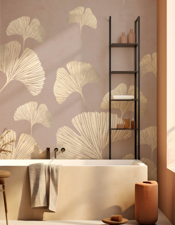
Muted botanical silhouettes. Faint, single-tone leaf or branch outlines add a hint of nature without turning into a full floral statement.
Grasscloth style texture. A woven, organic-looking finish adds warmth and a tactile quality that feels distinctly high-end.
Soft ombre gradients. A slow colour shift across the wall creates depth and interest while still staying in a restrained palette.
Metallic hint finishes. A wallpaper with the faintest metallic sheen catches light subtly, adding polish without turning glam.
Minimal abstract prints. A gentle pattern design wallpaper with soft, blended shapes offers just enough personality to avoid feeling sterile.
Best Minimalist Wallpaper Colours for a Premium Look
Neutral doesn't mean boring, and colour choice does most of the heavy lifting here.
- Warm greige and taupe tones, which feel grounded and sophisticated
- Soft sage or muted olive green, adding a quiet, earthy warmth
- Dusty blues and soft greys, calm without feeling cold
- Warm off whites, better than stark bright white for a premium feel
- Muted terracotta or blush, when used sparingly as an accent tone
Minimalist Wallpaper Ideas for Different Rooms
Living rooms. A textured neutral or soft tonal stripe works beautifully behind a sofa or media unit, adding depth without competing with furniture or artwork.
Bedrooms. A calm bedroom wallpaper choice in muted botanical silhouettes or a grasscloth style texture creates a restful, cocooning feel that suits a space meant for winding down.
Home offices. Fine linear patterns or micro geometric prints add just enough structure to feel professional without becoming distracting during a long workday.
Hallways and entryways. A subtle metallic hint finish makes a strong first impression the moment someone walks in, without needing bold colour to do it.
Dining spaces. A soft ombre gradient or marble effect wallpaper adds a quiet sense of occasion, especially under warm evening lighting.
How to Choose Wallpaper That Looks Expensive
Material quality matters more than most people expect. A thicker, well finished wallpaper simply reads as higher end, even in a plain colourway, compared to a thin, glossy print. Check the finish under different lighting too, since matte and subtly textured finishes tend to look more refined than anything overly shiny.
Scale is another detail worth getting right. A pattern that's too large for a small wall, or too tiny and busy for a big one, throws off the whole effect. And when you're browsing wallpaper design ideas, pay attention to how the sample photographs in natural light versus warm indoor lighting, since colours can shift more than expected between the two.
Common Mistakes to Avoid With Minimalist Wallpaper
Choosing something too plain. Genuinely flat, textureless wallpaper can end up looking cheap rather than restrained, so some subtle depth is worth keeping.
Skipping the sample stage. A neutral tone that looks warm on screen can read cold or grey on your actual wall, so always test before committing.
Mismatching finish and lighting. A glossy finish under harsh overhead lighting can look plasticky rather than premium, so match the finish to the room's typical lighting.
Overdoing texture everywhere. Too much texture across every wall in a room can feel heavy instead of elegant. Balance it with smooth surfaces elsewhere.
How to Make Minimalist Wallpaper Work in a Small Room
Small rooms benefit the most from restraint, but a little texture and colour depth still go a long way. Lighter tones with a subtle sheen help bounce light around, which keeps the space feeling open rather than boxed in. A gentle, simple wallpaper for walls choice, applied to just one wall rather than all four, can add character without overwhelming limited square footage.
Vertical elements, like a fine stripe or a linear pattern, also help lift the perceived ceiling height, which matters a lot in compact rooms. Avoid anything with a large repeat or heavy contrast, since that tends to shrink a small space visually rather than enhance it.
Explore Minimalist Wallpaper Designs With Space of Joy
If understated, premium-looking walls are what you're after, Space of Joy has a growing range of textured neutrals, soft tonal patterns, and refined simple wallpaper for walls options built for exactly this kind of interior. From subtle texture wallpaper to quiet geometric repeats, the collection is designed to add depth without ever feeling loud. Every order ships with a five-year warranty and a 48-hour dispatch window, so upgrading a plain wall doesn't come with months of waiting.
Final Thoughts: Simple Walls Can Still Make a Statement
Minimalist doesn't mean forgettable. The right simple wallpaper for walls choice, paired with a considered colour and a bit of texture, can make a room feel far more expensive than its price tag suggests. Restraint, done well, often says more than a bold statement wall ever could.