


Colour Theory for Your Home: How to Choose Art That Lifts Your Mood
Your home is more than a physical space; it is an emotional environment that subtly shapes how you feel every day. Colour theory, a principle widely used in interior design,...
Your home is more than a physical space; it is an emotional environment that subtly shapes how you feel every day. Colour theory, a principle widely used in interior design,...

Your home is more than a physical space; it is an emotional environment that subtly shapes how you feel every day. Colour theory, a principle widely used in interior design, helps explain why certain rooms feel calming, energising, or overwhelming.
Colours influence the mind through psychological associations: soft blues can create calm, warm yellows may evoke happiness, and earthy greens often restore balance and focus. When colour wallpaper is applied to the wall, these effects become even more powerful because artwork is one of the most expressive visual elements in a home.

Choosing art is not just about matching cushions or paint; it is about curating mood. Whether you are designing a minimalist apartment in a busy city or a serene coastal home, the right colour palette in your artwork can transform how you experience your space. Understanding the colour wheel allows you to create interiors that feel intentional, uplifting, and deeply personal.
Colour wheel theory is the foundation of visual harmony in interior design. It explains how colours interact with each other and how they influence perception. According to design principles, colours can be broadly divided into warm, cool, and neutral tones.
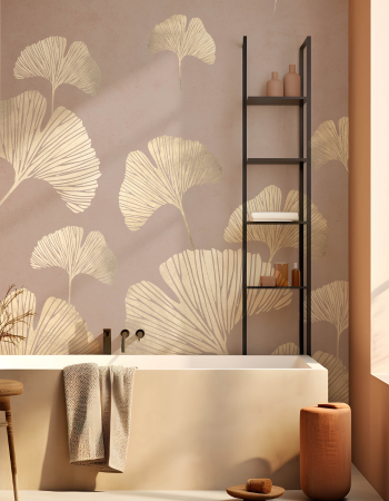
Warm colours like reds, oranges, and yellows tend to energise a space and encourage social interaction. Cool colours such as blues and greens are associated with calmness and relaxation. Neutrals, beige, white, and grey, create balance and allow other design elements, such as artwork, to stand out.
In home décor, these principles are often used to set the emotional tone of each room. For example, living rooms benefit from balanced warmth and neutrality, while bedrooms often suit cooler, softer colour wallpaper that supports rest.
Wall decor is one of the most effective ways to introduce colour psychology into your home without committing to permanent changes like repainting walls.

Blue artwork encourages calmness and mental clarity, making it ideal for bedrooms or study areas.
Green artwork promotes harmony and balance, often used in living rooms or reading corners.
Yellow and golden tones bring optimism and warmth, perfect for entryways or social spaces.
Red and terracotta hues stimulate energy and passion but should be used as accents rather than dominant tones.
Even abstract wallpaper from Space of Joy can subtly influence mood through its colour composition, not just its subject matter.
When selecting artwork, always consider how the room is used.

In living rooms, go for balanced living room wallpaper collections from Space of Joy that combine warm and cool tones to encourage both relaxation and conversation.
In bedrooms, softer palettes with muted blues, pinks, or earthy neutrals help create a restful environment.
In home offices, cooler tones like green and blue improve concentration and reduce visual fatigue.
In hallways and entrances, bold or uplifting artwork can create a welcoming first impression.
This functional approach ensures your home feels both beautiful and emotionally aligned.
A common mistake in home styling is choosing artwork purely based on personal preference without considering balance. A visually harmonious home typically follows one of three approaches:

Monochromatic schemes (variations of one colour) for a calm, unified feel
Analogous schemes (adjacent colours on the colour wheel) for subtle variety
Complementary schemes (opposite colours) for bold, energetic contrast
When selecting modern wall art, these schemes help maintain visual flow while still allowing personality to shine through.
While theory provides structure, personal emotion completes the picture. The colours you are naturally drawn to often reflect your personality and lifestyle. A vibrant, expressive person may prefer bold abstracts, while someone seeking calm may gravitate towards soft landscapes or minimal line art.

Art should not only match your interior, but it should also reflect your inner world. That is where emotional design becomes truly powerful.
Final Thoughts
Choosing the right artwork using colour theory is one of the simplest yet most powerful ways to transform how your home feels on a daily basis. When you align colour choices with mood, whether calming blues, uplifting yellows, or grounding earthy tones, you create interiors that genuinely support your wellbeing, not just your aesthetic taste.
Explore thoughtfully curated wallpaper and wall décor collections at Space of Joy designed to bring balance, warmth, and personality into your home interiors.
Discover your perfect mood-lifting art today at Space of Joy!
1. What is the colour theory test in interior design?
Colour theory tests explain how colours interact and how they influence mood, perception, and harmony within a space.
2. Which colours are best for relaxation at home?
Soft blues, muted greens, and neutral tones like beige and grey are most effective for creating a calming environment.
3. How do wall art prints affect mood?
Wall art prints influence mood through their colours and composition, which can evoke feelings of energy, calmness, creativity, or balance.
4. Should I match wallpaper with furniture?
Not exactly. It’s better to complement your furniture palette rather than match it perfectly, to create visual depth and interest.
5. Can bold artwork be used in small spaces?
Yes, bold art can actually make small spaces feel more dynamic if balanced with neutral surroundings

Your cart is currently empty.
Start Shopping


